An effective main menu
Hellooo. I'm pretty much just writing to myself, buuut: after a 5 months semi-hiatus to move house, I was finally able to get back into the groove to work on OverGem. The fact that I am able to post this dev blog at all must mean I have some time on my hands. Anywho, today I'm going to talk about what I've been doing (very slowly) over the last couple of months: The Main Menu!
The Main Menu is the first interaction a player has with a game. In my opinion, it is an opportunity to make a good impression for the rest of the game.
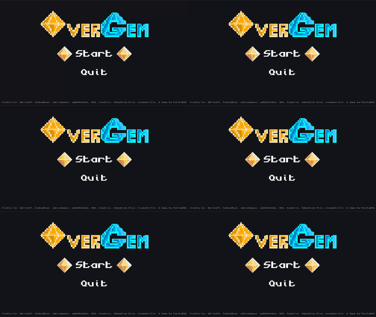
OverGem's Menu initially looked like this

... At this point, I have decided that I want to go that extra mile for OverGem, despite knowing that I will regret it later.
After having read [Max Pears' article on Gamasutra](https://www.gamasutra.com/blogs/MaxPears/20160421/270579/Setting_the_Tone_Main_Menus_are_the_Game.php) about how important the Main Menu is, and essentially how to make a good one, I decided to make 2 changes to OverGem's menu.
The first change is the overal looks of the Main Menu itself:

[I made the title real shiny!](https://loveglitchcoffee.itch.io/overgem/devlog/148969/making-the-menu-shine), which accomplishes two things: Firstly, I think it draws the attention of the player to the title, making it more likely for them to remember the name of the game. Secondly, its better than animating the items on the main menu itself ... which doesn't accomplish much. Using highlight and text enlargement is enough for players to navigate the main menu. Having those two animated gems for navigation, as I did before, looks quite ... clunky?
This change in the looks is not quite following Max's advice in the article. But, I was inspired to not leave the Main Menu looking as shabby as it did before. Its a start, despite the fact that it still looks a bit lifeless.
The second change I made is the transition from the Main Menu into the gameplay:

This is where I took the article's advice to heart. I also want to 'tell a story' through the scenes of the game that isn't gameplay.
I want to draw the players' attention to the 'O' gem in the title. Its the OverGem after all, identical to the one the players need to grab in-game! So, I used the 'O' gem in the title to transition from the Main Menu, all the way through Character Selection and Loading Screen, and into the game leve itself, keeping the players' focus on the gem. I am hoping that this focused transition gives the player an intuition that they need to do something with the OverGem in-game. I will still probably add some flashy text to make sure that the players know exactly what they're doing, of course. But, hopefully this make the 'flow' of the game more lively and interesting.
There is still work to be done, but I think its starting to look like its coming together!
OverGem
One-Hit Brawler
| Status | In development |
| Author | Hung Hoang |
| Genre | Fighting |
| Tags | 2D, Local multiplayer, party-game, Pixel Art |
More posts
- Unity - a statementSep 04, 2021
- Well, it has character(s), part 3Aug 20, 2021
- Making the menu shineMay 30, 2020
- Floating SkiesMay 23, 2020
- Demo and showcase at PoCInPlayMay 23, 2020
- Using Unity's new Input SystemMay 23, 2020
- Well, it has Character(s), part 2May 23, 2020
- Well, it has Character(s)May 23, 2020
- The OverGemMay 23, 2020

Leave a comment
Log in with itch.io to leave a comment.